Background
The Library website is the online portal for our users to find information and access our services. We were going to embark on a project to redesign the website; the first step of that effort was to find out how the HKUST community use the Library website. In Spring 2014, the Library conducted three interactive Web Design Workshops with students, and an online survey to get input from both staff and students. The exercise helped the Library to have a better understanding of our users’ expectations of the Library web service, and the shortcomings of the existing website. The findings will inform our decisions in the subsequent web redesign effort.
Our users’ input collected via the Workshops and the survey is presented here.
Web Design Workshops
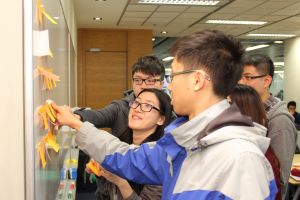
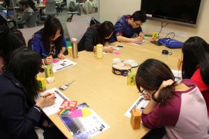
About 50 students attended the three workshops in March 2014, each lasted 1.5 hours.
There were three parts in the workshops:
- Students used post-its to describe their online activities and their purposes of visiting the Library website
- Using the existing Library website, students marked the links or services that they found most useful, and those they found not useful
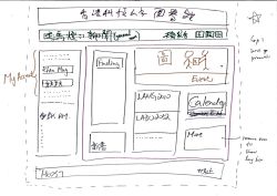
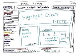
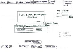
- Working in small groups, students designed different layouts and navigation paths for the Library website on blank sheets of paper
Participants’ Activities in Current Website
Students use the Library website for:
- Find/search materials of various kinds
- Reserve rooms
- Access “My Account”
- Sign up classes or events
- Find Library information, mainly hours and floor plans
At the current website, the most frequently used areas / links are
- Reserve Rooms
- Catalog search box
- Databases tab
- My Account (at Quick Links menu)
At the current website, the least used / least effective areas are
- Featured resources (at Featured column)
- Services links for different user groups
- “Services A-Z | HKUST Publications” block
- “More…” for Collections
- Promotional posters (at lower right)
Students’ Web Designs
The participants produced interesting designs with new ideas. A few major themes were:
Make functional services the focus of the Home Page: One big area for searching; frequently used links should be made prominent (e.g. reserving room, course information, and self-learning materials
Improve searching experience: Reduce search options; the existing design (e.g. choice of catalog interfaces, choice of databases) are confusing. Let users have one search box, then use options to filter AFTER a search
Create single login: Put username / password boxes at the home page for logging-in. No further login will be required when accessing different services, such as My Account, room booking, and even LMES
Make one-stop for course information: For easy access to course reserve, course guides, video lectures, course description, class schedule and past papers
Redesign Room Booking System: Use maps to visualize the booking process
General design suggestions: Use bigger font at Quick Links, less text and more animation, more campus photos, use icons for services, use sliding display to show book covers
Online Survey
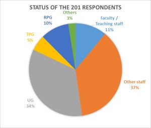
To complement the student input collected from the Design Workshops, we conducted an online survey in April that invited university staff to give us their views about the Library website. Students could also fill out the survey.
The survey received 201 responses. There was a good portion of staff representation.
Overall Results
The survey responses gave us data to compare and contrast web behaviors and preferences of different user groups. It indicated that, staff and PGs used the Library Web for more activities than UGs, although their core purposes were still very much on searching for resources. They also tend to use the textual parts at the Homepage a bit more than UGs (the Information and Collections columns). Nevertheless, they gave the same types of suggestions as UGs: simplify the layout, improve the search area, use more icons/images, highlight resources, and make events more accessible.
Go Back to page Toplast modified 03 October 2016

